** IN PROGRESS **
PMI Unified User Account
Supporting Interaction and Encouraging Engagement While Creating Useful & Usable Tools: Creating Value for the User and the Business
Project Feedback:
“I love it. Really great work. These are great ideas.”
Purpose of the Project:
In 2013, the Project Management Institute (PMI) acquired ProjectManagement.com and ProjectsAtWork.com. PMI wanted to improve its services to its users. The organization was excited about the acquisition of ProjectManagement.com because it brought an active professional community exchanging ideas, tools and experience on topics in project management.
The first step was to merge the user account and public profile for both sites. Members of each entity would now be members of the other and would need to access its information and resources.
In addition, ProjectManagement.com was still lacking in core services provided to users to navigate the large amount of content on the site, their activity within that content and around the site, and to increase meaningful engagement between users.
Problem Frame:
User feedback:
- Users got lost in the mass amount of content and navigation
- There was no way for users to remember how they had gotten somewhere; if they commented, read or interacted in some way - how to get back there at a later date. How would they know if someone responded - to anything?
- Overwhelmed at the home page "What the hell is this, what do I do here?" "This is a networking site? How?"
- "This looks terrible. Who uses this. Who are the smurfs at the top of the page?"
Old Site
Guiding Design:
- Surface user activity information that is already being collected - for the user, their network, and the site overall.
- Call out and reward users with badges and positive feedback for meeting significant benchmarks for participation.
- Call out what others users in someone's network are doing, in particular those they have interacted with.
- Analyze features that receive little use. Redesign or delete?
Featured Design Change
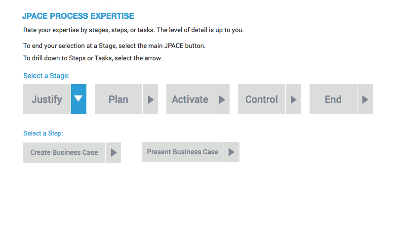
The redesign of the JPACE tool was a significant and unique design challenge I proposed to be included in this project. While not readily apparent as a part of the core of the design mission, it was a significant issue contributing to users' cognitive overload and frustration when they would encounter tools that were klunky and confusing, and most importantly provided no real value to either the user or the business.
The first step was to question its usefulness. It was difficult to use, but was this the only reason users didn't use it? If it was not fundamentally useful information for users, giving them a significant benefit for the time they would invest in it, and the business wouldn't gain anything from the user's contribution, then it should be taken out entirely. There would be no reason to make the tool more usable, if it would never be useful.
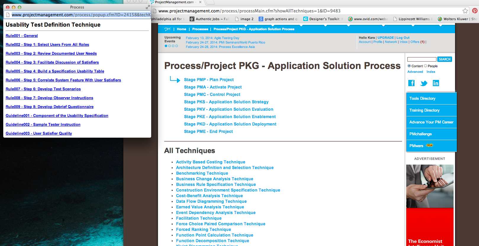
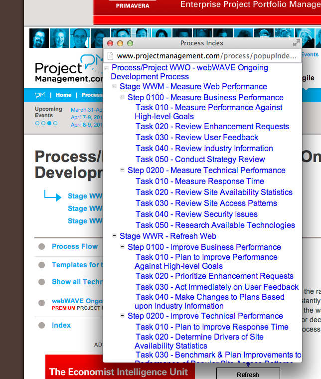
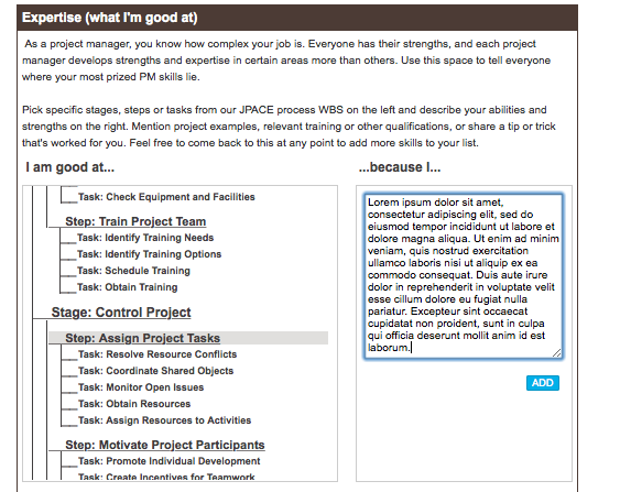
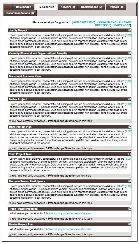
What may be difficult to see from the screenshots below was also difficult for the user to decipher. The editing window was hidden in the middle of a myriad of user account settings and notifications. Edits and additions could be seen immediately below the tool with the ability to edit or delete, however if a user wanted to see how it really appeared publicly they would have to go to their Profile page and select the PM Expertise tab.
The reality was that I never saw a user profile containing any information created with this tool.
Previous JPACE Design
JPACE Design Proposal
There were several objectives with the redesign of the JPACE tool.
- Simplify what we were asking the user to do. Asking someone to explain why they are good at something is actually a big task.
- Less grade school sounding. More professional. Less text!
- More visually appealing. Less visual noise.
- Quantify the information so that it is searchable. Quantifiable and searchable is usable information.
- Make it quick and FUN to fill out. If it's quick and fun, users will get over the decision barrier quicker concerning whether it's worth their time. (Give it a little slide, just a touch of bounce!)
Modifying the question and reporting mechanism to prioritize quantifiable data would allow for significant changes in product strategy and development down the road. If the PM.com database now had data on users expertise in different areas of the project management structure users could search for entry level candidates as well as mid and senior level PM's and target just the skills they were looking for. Even if users did not fill out any description about their experience, their assessment of their skill level and years on the job would still be significant and usable self-reporting. Users looking to network could at least filter based on JPACE responses and ask further questions. Users made aware that this would help them network on the site, would then be more encouraged to take the few minutes to self-report on their specific skills. Currently, there is no way to search for users based on their level or specific type of experience.


